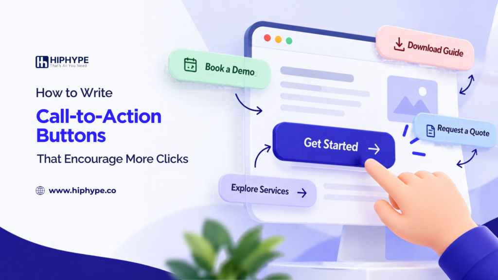
A call-to-action (CTA) button helps visitors take the next step on your website. It may encourage them to book a consultation, request a quote, download a guide, or explore a service.
However, a button that simply says “Submit” or “Click Here” may not clearly communicate what visitors will get after clicking.
Writing effective call-to-action buttons starts with understanding your audience, choosing clear words, and matching the message to the action you want visitors to take.
What Is a Call-to-Action Button?
A call-to-action button is a clickable website element that guides visitors towards a specific action. It is commonly used on landing pages, service pages, product pages, and contact forms.
Examples of CTA buttons include:
- Book a Consultation
- Get a Free Quote
- Download the Guide
- Explore Our Services
- Start Your Project
A good CTA tells visitors what they can do next and sets a clear expectation about what happens after they click.
1. Use Clear and Action-Oriented Words
Visitors should understand the purpose of a CTA without having to guess. Use direct language that describes the action you want them to take.
For example, use “Explore Our Services” instead of “More Information” when visitors want to learn about your services. On a quote request form, “Request a Quote” is more descriptive than “Submit.” Similarly, use “Download the Guide” when offering a downloadable resource instead of a vague phrase such as “Click Here.”
The best wording depends on the page and the action. Avoid choosing a phrase simply because it sounds catchy if it does not accurately describe the next step.
2. Focus on the Value for Visitors
A CTA becomes more meaningful when its wording communicates what visitors will receive or achieve. Instead of using generic button labels, choose text that clearly explains the next step.
For example, use “Explore Our Services” instead of “Learn More” when visitors want to understand your services. On a quote request form, “Request a Project Quote” can be more descriptive than “Submit.” Similarly, “Create Your Account” tells visitors more than a general “Sign Up” button.
Specific wording helps visitors understand the purpose of the action. Only promise benefits that your business can genuinely deliver.
3. Match the CTA to the Page Content
Your CTA should feel like a natural next step after visitors read the page. The button text should relate directly to the information they have just explored.
For example, a digital marketing service page might use “Discuss Your Marketing Goals,” while a blog offering a downloadable checklist might use “Download the Checklist.”
If the page explains a service but the button leads somewhere unrelated, visitors may feel confused. Keep the button message, surrounding content, and destination aligned so visitors know what to expect.
4. Choose the Right CTA for Each Stage
Not every visitor is ready to make a purchase or contact your business. Some are still researching, while others are comparing options or preparing to take action.
Consider these examples:
- Early research: Explore Our Services
- Comparing options: View Pricing
- Ready to enquire: Request a Consultation
- Ready to purchase: Buy Now
Choose wording that matches what visitors are likely looking for on that particular page. A strong CTA guides the next step without pressuring visitors into an action they are not ready to take.
5. Keep Button Text Short and Easy to Understand
Long button labels can be difficult to scan, especially on mobile screens. Aim for concise wording that communicates one clear action.
For example, “Get Your Project Quote” is easier to understand at a glance than “Click Here to Submit Your Information and Receive a Quote.”
Check that the complete label remains readable on smaller screens. Avoid unnecessary words and abbreviations that your audience may not understand.
6. Make the CTA Consistent with Its Destination
The button should deliver what its wording promises. Visitors should not have to guess what will happen after they click.
If a button says “Download the Guide,” visitors should be able to access the guide. If it says “Book a Consultation,” the next step should support booking or clearly explain how to arrange the consultation.
Misleading button text can damage trust, even if it attracts clicks. Before publishing, check the button link, destination page, and any required action to ensure the experience matches the message.
How to Evaluate Your CTA Button Wording
Review your existing website buttons and ask yourself three questions:
- Is the intended action clear?
- Does the wording match the visitor’s needs and the page content?
- Does the destination deliver what the button promises?
You can also review button click events in your analytics platform if tracking is configured correctly. This can help you understand which buttons visitors interact with and whether those interactions lead to meaningful outcomes.
Remember that more clicks do not always mean better results. A CTA should attract relevant actions, such as qualified enquiries or completed bookings, rather than clicks alone.
Conclusion
Effective call-to-action buttons use clear language, communicate relevant value, and guide visitors towards an appropriate next step. The right wording depends on your page, audience, and business goal.
Review your current CTA labels, replace vague phrases with specific actions where appropriate, and make sure every button leads to the expected destination. These practical improvements can make your website easier to navigate and help visitors understand what to do next.
Frequently Asked Questions
1. What Is a Call-to-Action Button?
A call-to-action button is a clickable website element that encourages visitors to complete a specific action, such as booking a consultation, making a purchase, or downloading a resource.
2. What Makes a Good CTA Button?
A good CTA button uses clear, concise, action-oriented wording that matches the page content and tells visitors what to expect after clicking.
3. What Are Some Examples of Effective CTA Buttons?
Examples include “Book a Consultation,” “Request a Quote,” “Download the Guide,” and “Explore Our Services.” The most suitable option depends on the intended action and the page where the button appears.
4. Should CTA Buttons Say “Submit” or Use Specific Wording?
Specific wording is often more informative when it accurately describes the next step. For example, “Request a Quote” communicates more context than “Submit” on a quote request form.
5. How Long Should CTA Button Text Be?
CTA text should be short enough to scan quickly while remaining clear. There is no universal word limit, so check readability on both desktop and mobile devices.
6. Where Should CTA Buttons Be Placed on a Website?
Place CTAs where visitors can take the next relevant step, such as near a service explanation, pricing information, or the end of a useful article. Placement should suit the page structure and visitor needs.
7. How Can I Measure CTA Button Performance?
Track relevant button clicks and completed actions, such as enquiries, bookings, or purchases. Compare these metrics to understand whether the CTA attracts meaningful engagement, not just clicks.